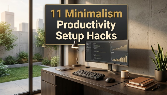
Setup minimalism has become one of those quiet revolutions in how people work and live. The idea is simple: strip your desk, your computer, your entire digital and physical workspace down to what you truly need. Fewer cables, fewer gadgets, fewer notifications. Just the essentials, arranged in a way that feels calm and intentional. It’s appealing because most of us have spent years drowning in clutter—physical piles of papers, digital inboxes with thousands of unread emails, RGB lights flashing for no reason. Minimalism promises clarity, focus, and even a little bit of peace in an overstimulated world.
I got into it myself about five years ago after staring at a desk that looked like a tech store exploded on it. Multiple monitors, a tangle of wires, random peripherals I swore I’d use “someday,” and a chair that hurt my back after two hours. I started removing things one by one, and the relief was immediate. Productivity went up, neck pain went down, and the space felt like mine again. But along the way, I watched friends and online communities make the same missteps over and over. They chased the aesthetic so hard they ended up with setups that looked great in photos but felt terrible to use day after day.
The problem isn’t minimalism itself. It’s how people approach it. They read one blog post or watch one YouTube video and think “less is always better,” without considering context, body, workflow, or long-term sustainability. Here are the five biggest mistakes I see people make when trying to build a minimalist setup—and more importantly, how to sidestep them so you don’t end up regretting the purge.
Mistake 1: Confusing Minimalism with Emptiness
The most common trap is thinking that a truly minimalist desk means nothing on it except a laptop and maybe a keyboard. You see those pristine white setups on Instagram or Reddit: one MacBook, one monitor, zero personal items, not even a coaster. It looks clean, sure, but sit at it for eight hours and tell me it doesn’t feel cold and soulless.
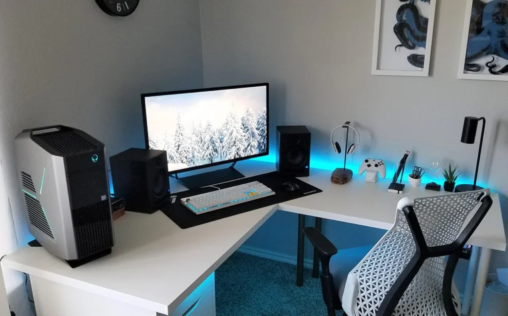
Why this happens is understandable. People hear “minimalism” and immediately equate it with zero. They clear everything off the desk in one aggressive sweep, then stare at the barren surface and wonder why they feel uninspired. The truth is, emptiness isn’t minimalism—it’s absence. Real minimalism is intentional curation. You keep only what serves a purpose, but that purpose can include joy, inspiration, or simple human comfort.
When the desk is completely bare, you lose warmth. No plant to remind you of the outside world, no small object that sparks a memory, no subtle texture to break the monotony. Over time, that sterility drains motivation. Studies on workspace psychology show that environments with zero personal elements can increase stress and reduce creativity. People end up adding things back haphazardly, creating clutter again.
I did this myself once. After decluttering, my desk had only a laptop stand, a keyboard, and a mouse. Nothing else. For the first week it felt liberating. By week three, I hated it. The space felt like a hospital tray table. I started bringing in one small thing at a time: a tiny ceramic cup for pens (three pens max), a single framed photo from a trip, a low-maintenance succulent. The desk stayed minimal—about 70% clear—but now it had life.
To avoid this mistake, follow the 60-70% rule. Keep most of the surface free for actual work, but allow two to four thoughtful items that earn their place. Each should be functional, beautiful, or meaningful. A wooden phone stand that holds your device at the perfect angle. A small plant that purifies air and adds green. A single art print leaned against the wall instead of hung. The key is restraint—don’t let it creep to ten items. Quality over quantity. One well-chosen object beats five mediocre ones every time.
If you’re worried about slipping into clutter, start small. Pick one item that makes you smile every time you see it, place it, and stop. Let the rest breathe.
Mistake 2: Sacrificing Function for Aesthetics
This one hurts because it’s seductive. You see a gorgeous setup online: matte black everything, ultra-thin monitor arms, a keyboard that looks like it belongs in a museum. You buy the pieces, assemble them, and then realize the mouse pad is too small, the keyboard flexes when you type hard, and the monitor arm sags after a month. It looks perfect in a photo, but using it daily is frustrating.
The root cause is prioritizing visual minimalism over practical minimalism. People get caught up in the “clean lines” aesthetic and choose items that match the vibe but fail in real life. A sleek cable organizer that doesn’t hold cables securely. A minimalist chair with no lumbar support. A beautiful wooden tray that tips over when you put anything heavier than a phone on it.
The consequences are sneaky. At first, you ignore the small annoyances because the desk looks so good. Then the frustration builds. Typing becomes tiring. Your back hurts. You spend more time fixing problems than working. Productivity suffers, and eventually you start adding “fixes” that ruin the minimal look anyway.
I learned this the hard way with a popular minimalist keyboard. It was low-profile, wireless, and looked incredible—until I tried to type for hours. The keys were mushy, the battery died fast, and there was no wrist rest. I replaced it with a slightly thicker mechanical one that had better feel and battery life. The aesthetic took a small hit, but the daily experience improved dramatically.
How to avoid it: always test function first. Before buying anything, ask: Does this solve a real problem in my workflow? Will it last more than six months? Can I use it comfortably for four hours straight? If the answer is no, pass—even if it looks amazing.
Look for items that do double duty: a phone stand that’s also a charger, a desk lamp that doubles as ambient light, a monitor arm with cable channels built in. Invest in quality where it matters most—ergonomic chair, good keyboard, reliable monitor—because those are the things you interact with constantly. Cheap out on display items like decor if you must, but never on tools.
Mistake 3: Sticking to a Cold, Monochrome Palette
Many people associate minimalism with white, gray, black, and nothing else. The classic “all-white setup” or “dark mode everything.” It photographs beautifully and feels modern, but after a few months it can feel like working in a void.
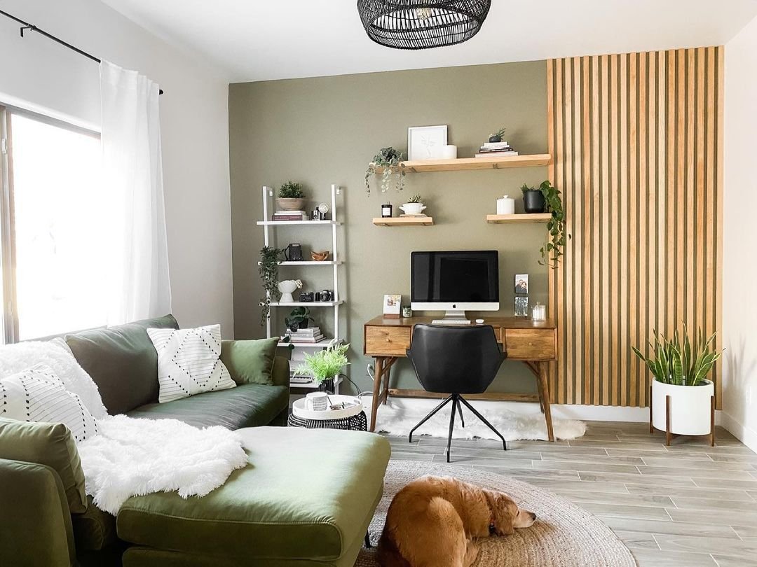
The issue is temperature—literal and emotional. Pure monochrome palettes lack warmth. No wood grains, no soft fabrics, no natural tones. The space feels clinical, and that affects mood. Colors influence psychology more than we admit. Warm neutrals like walnut, oak, or even a touch of beige can make a room feel inviting without adding clutter.
I switched from an all-white desk to one with a light oak top. The difference was immediate. The room felt cozier, my eyes rested better, and I actually enjoyed sitting down to work. It wasn’t about adding color for color’s sake—it was about balance.
To fix this, introduce natural materials. A wooden desk mat instead of plastic. A leather or fabric wrist rest. A plant pot in terracotta or bamboo. Even small brass or copper accents add subtle warmth. You don’t need bright colors—just avoid the hospital look. Warm minimalism is sustainable minimalism.
If you’re committed to monochrome, layer textures: matte vs. glossy, smooth vs. rough. A linen desk pad, a wool felt mouse pad, a matte monitor bezel. These small variations prevent the space from feeling flat.
Mistake 4: Ignoring Ergonomics in the Name of Clean Lines
This mistake is dangerous because it hides behind “minimalism.” People remove armrests, footrests, monitor arms, adjustable stands—anything that adds bulk—thinking it makes the setup cleaner. But a clean setup isn’t worth chronic pain.
Ergonomics isn’t optional. Poor posture leads to neck strain, wrist issues, back problems. I’ve seen people drop their monitor to desk level to avoid a stand, then crane their neck all day. Or use a tiny keyboard with no palm rest because it looks sleeker. The pain starts subtle, then becomes constant.
I ignored ergonomics early on. I had a beautiful low-profile setup, but my shoulders were always tense. Once I added a monitor arm and raised the screen to eye level, the difference was night and day. I also switched to a split keyboard and a vertical mouse. The setup looked slightly less “minimal,” but my body thanked me.
To avoid this, design for your body first. Measure your ideal monitor height (top of screen at eye level), keyboard angle (neutral wrists), chair height (feet flat, knees 90 degrees). Use tools that support good posture without adding visual noise—hidden monitor arms, under-desk keyboard trays, adjustable standing desks.
Minimalism and ergonomics aren’t enemies. The best minimalist setups are ergonomic by default because they prioritize function.
Mistake 5: Lacking Personal Connection and Meaning
The final mistake is creating a setup that could belong to anyone. Copied from Pinterest, no personal items, no story. It looks good, but it doesn’t feel like yours.
A desk without personality becomes a place you tolerate instead of enjoy. Over time, you disengage. Minimalism isn’t about sameness—it’s about intentionality. Including one or two meaningful items makes the space yours.
I added a small carved wooden elephant my grandfather gave me. Nothing flashy, but every time I glance at it, I remember his stories. It grounds me during stressful days.
To avoid this, ask: Does this item mean something to me? Does it remind me why I work? A photo of family, a quote you love engraved on a stand, a souvenir from a trip. Limit it—one or two items max. They should be small, purposeful, and not distract.
The goal is a setup that supports your life, not just looks good on camera. When it’s personal, minimalism feels authentic.
Wrapping Up
Setup minimalism done right is transformative. It clears mental space, reduces friction, lets you focus. But when people chase the look without considering function, comfort, warmth, and meaning, they end up with spaces that look impressive but feel empty.
The key is balance. Intentional choices over blind subtraction. Ask yourself at every step: Does this serve me? Will it last? Does it feel good? If yes, keep it. If no, let it go.
Start slow. Remove one thing today, add one thoughtful item tomorrow. Adjust as you live with it. Your perfect setup isn’t static—it’s one that evolves with you.